Visual development across Disney, Netflix, and Amazon — building worlds that serve story
Visual development is not illustration. It is the process of translating a script's intentions into a buildable visual language — every environment decision made in service of what needs to happen narratively in that space. The work shown here spans three productions across fifteen years: a Disney fantasy, a Netflix sci-fi thriller, and the largest television production in Amazon's history.
Across all three, the methodology is the same: start with the story's emotional and narrative requirements, then build the visual language that makes those requirements legible on screen. An architecture that reflects a character's psychology. A creature whose appearance embeds its narrative function. A market stall that communicates a civilisation's values through material and structure alone.
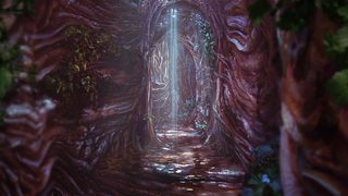
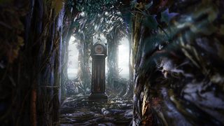
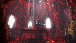
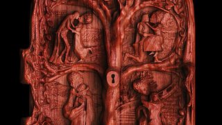
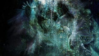
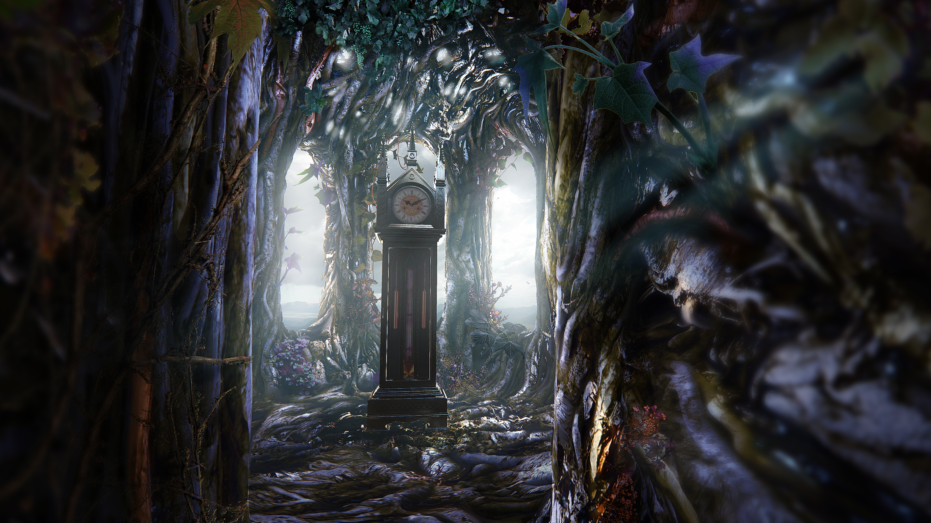
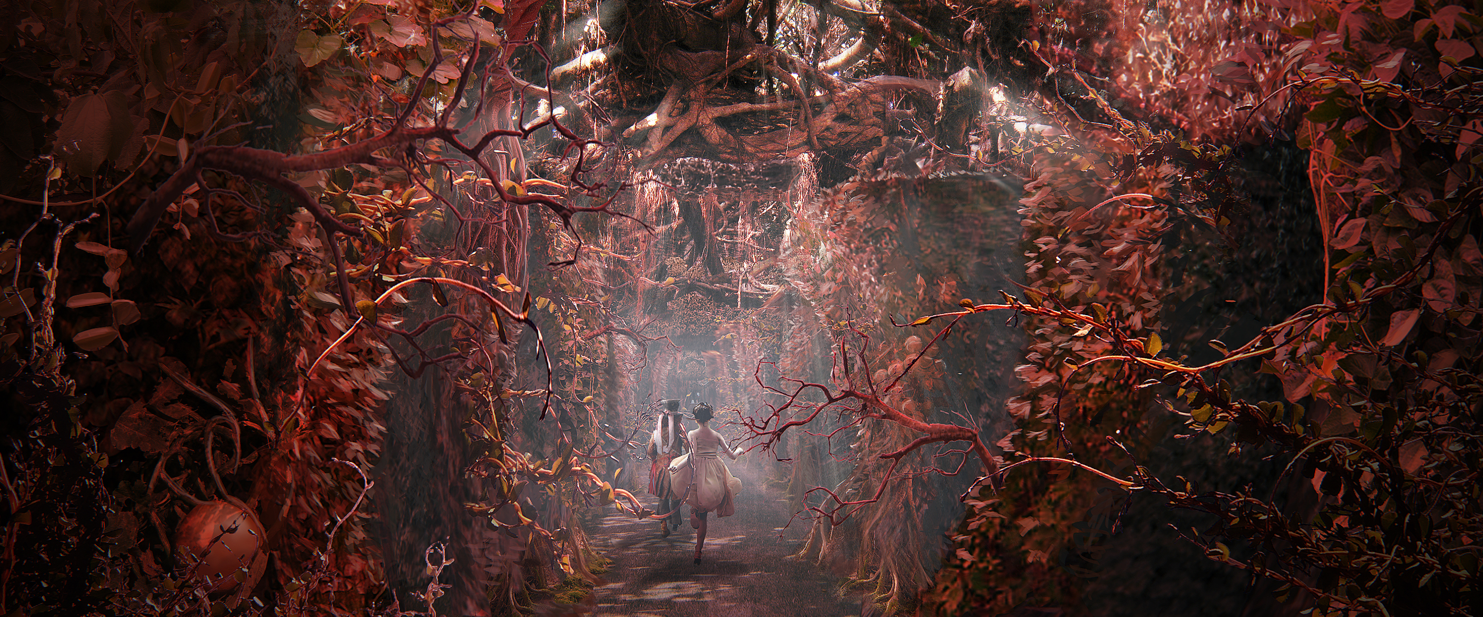
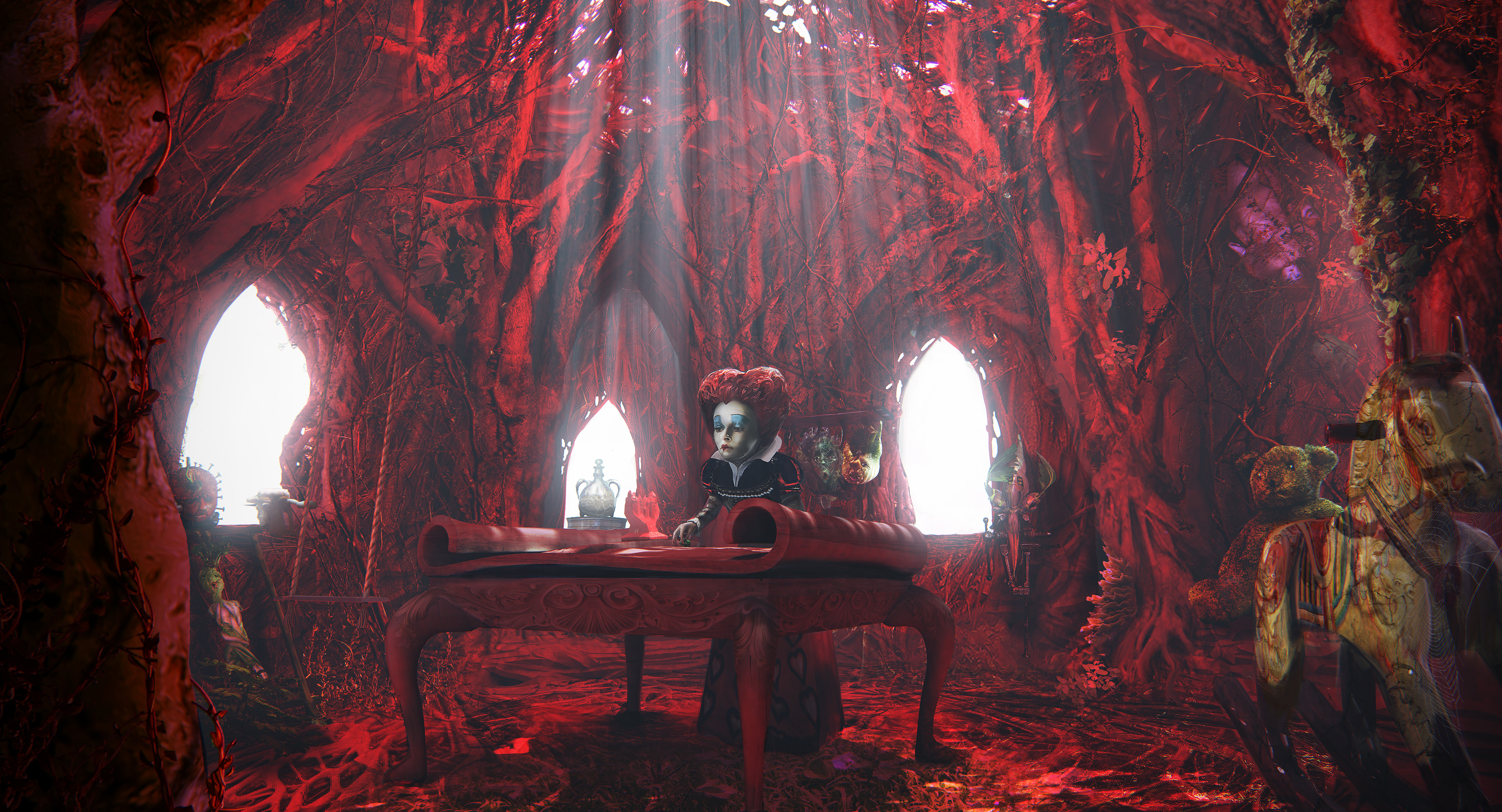
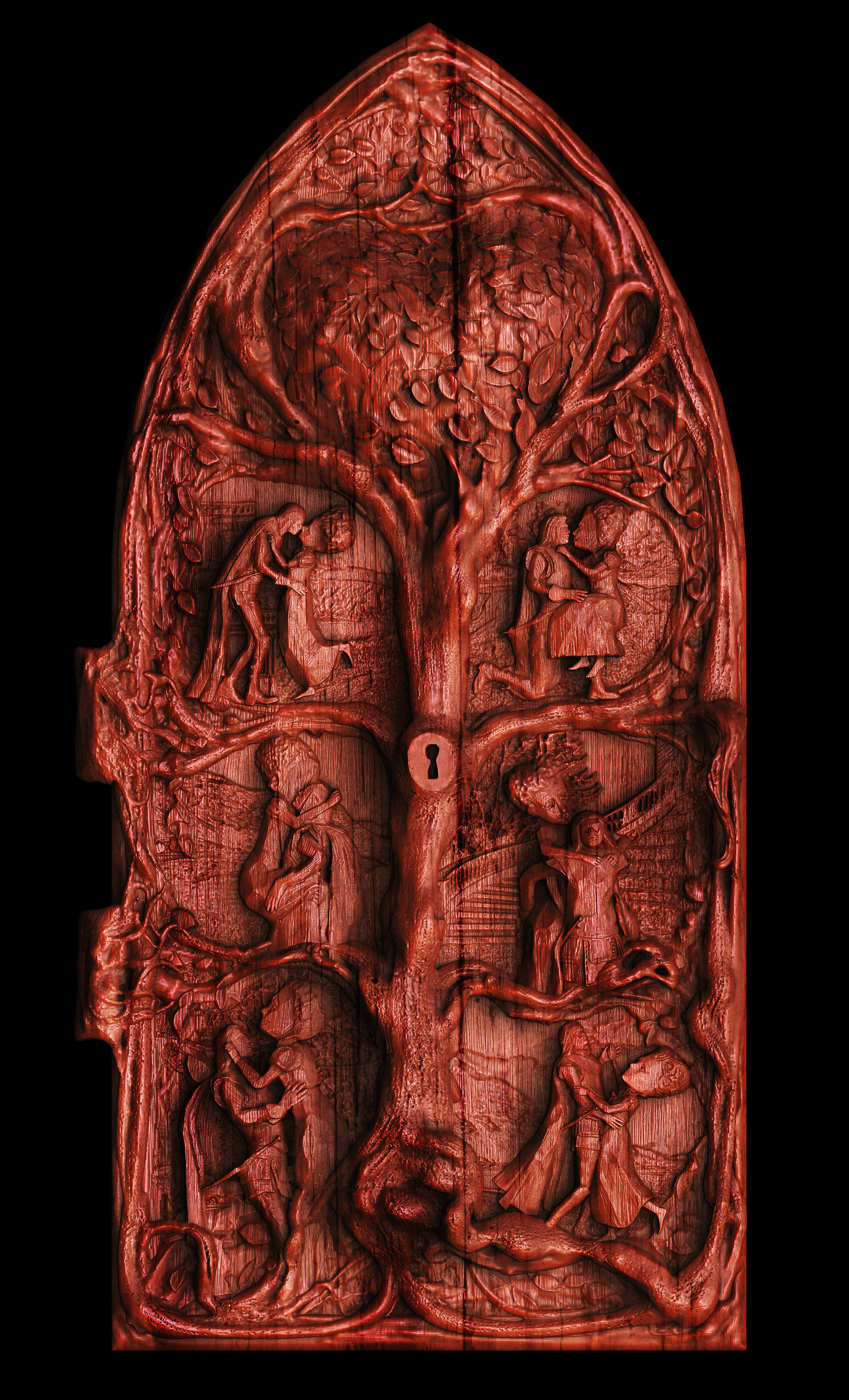
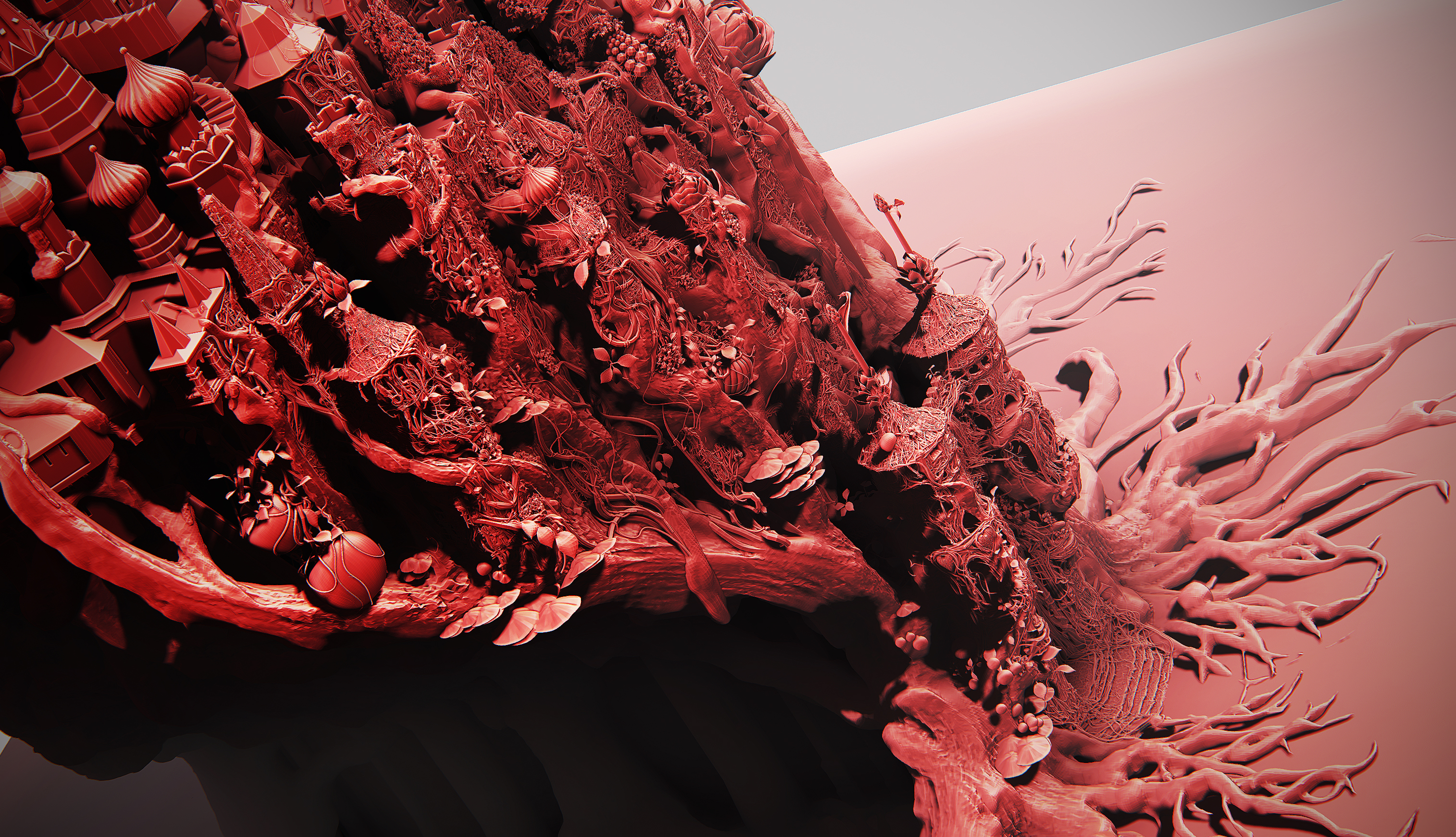
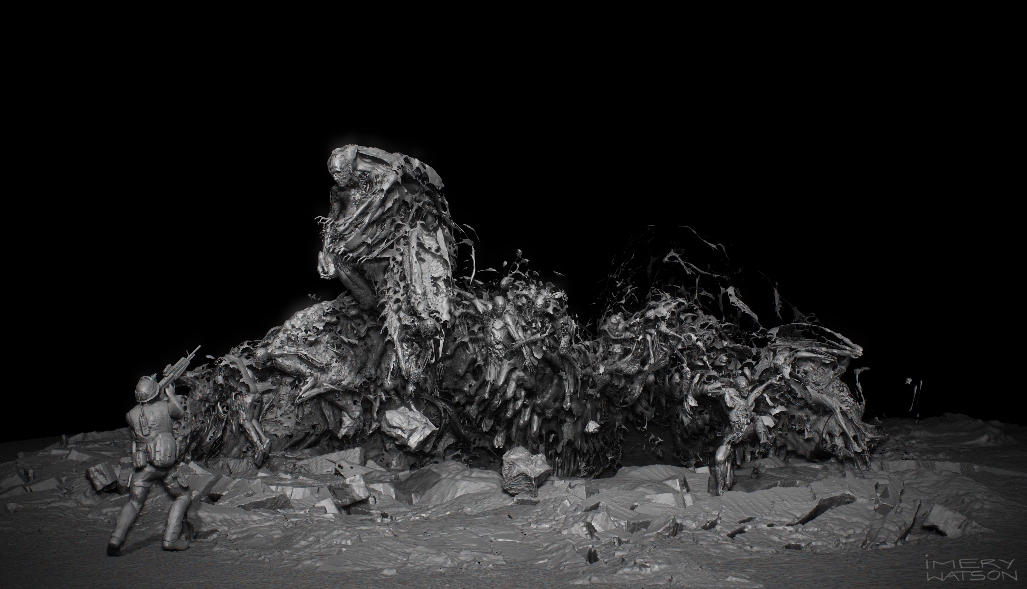
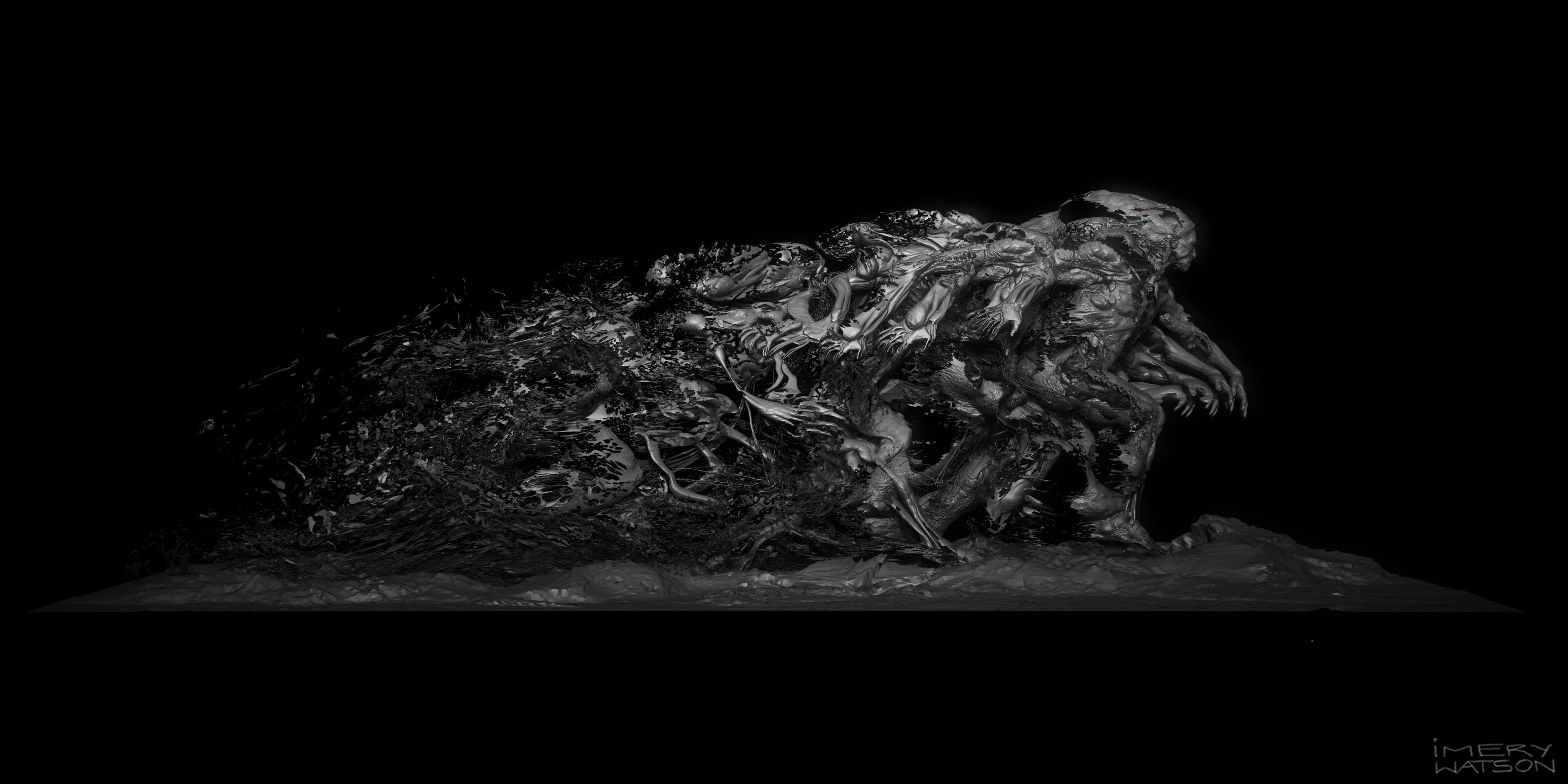
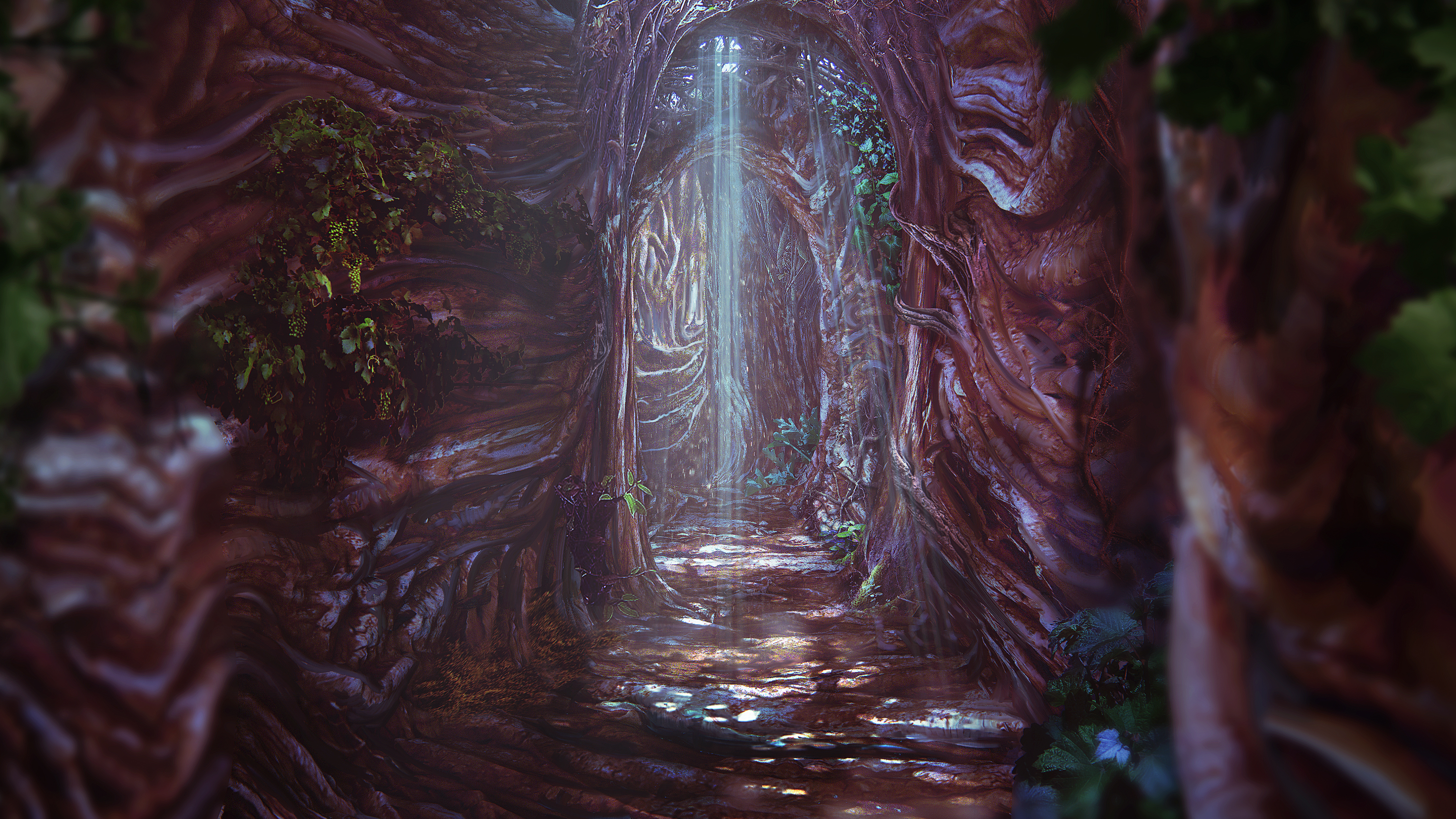
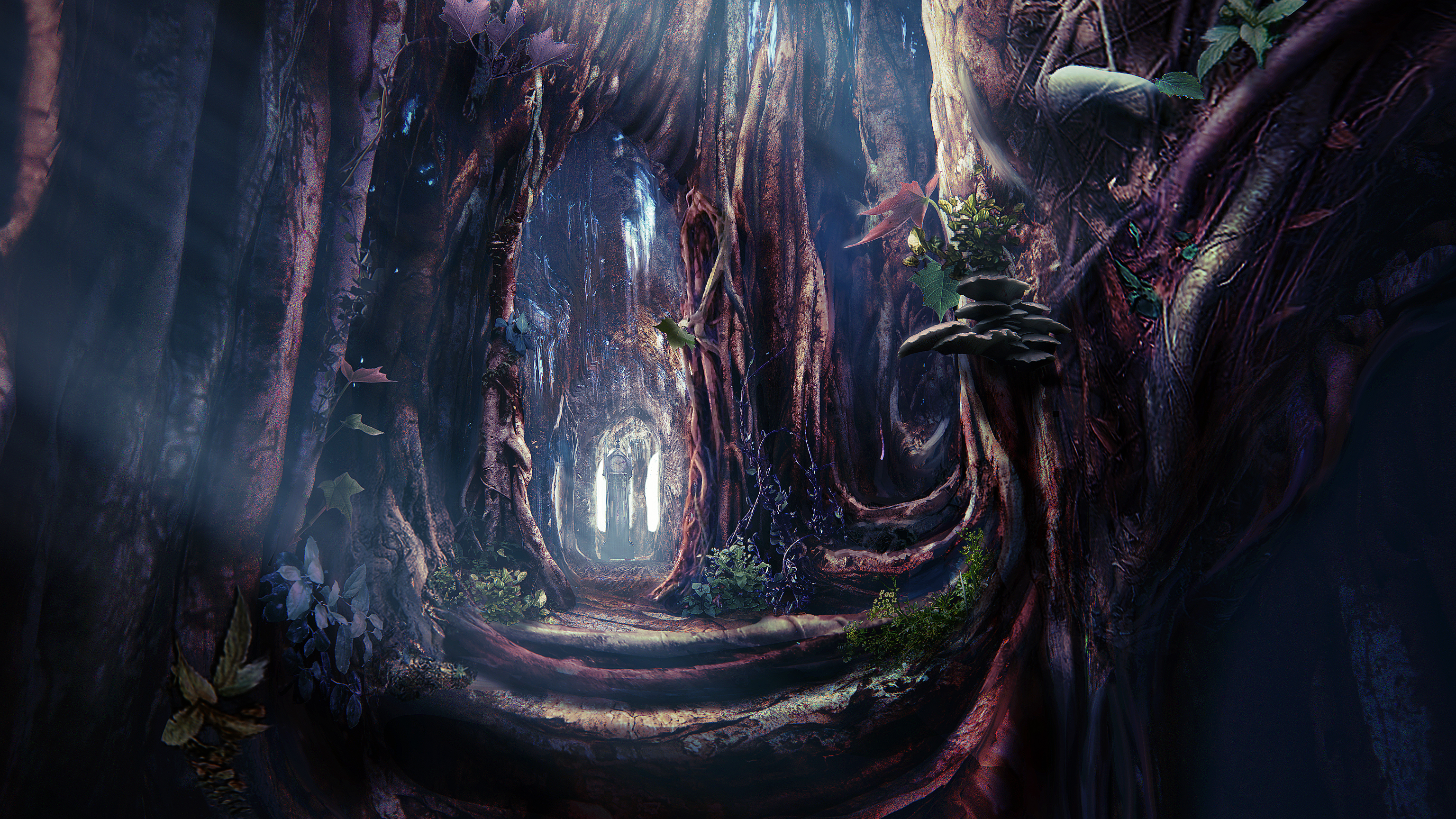
Iracebeth's domain for the Disney sequel required a visual language that externalised her character — obsessive, organic, overwhelming, suffocating in its richness. The architecture is not built, it has grown: a castle that is simultaneously a living organism and a monument to vanity. Every surface carries narrative weight.
The design process moved from environment paintings establishing mood and approach, through ZBrush sculpts developing the organic architectural surface language, to detailed set pieces including a narrative door whose carved panels tell the Red Queen's story across six scenes. The work was produced for the visual development phase prior to production design finalisation.
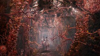
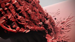
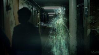
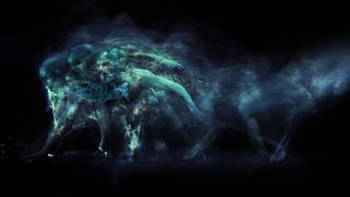
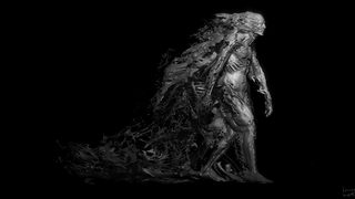
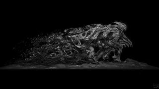
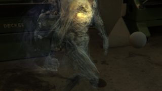
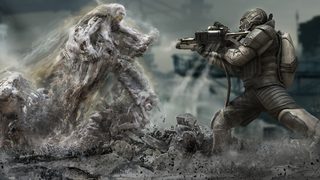
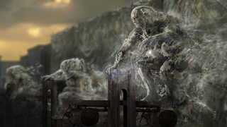
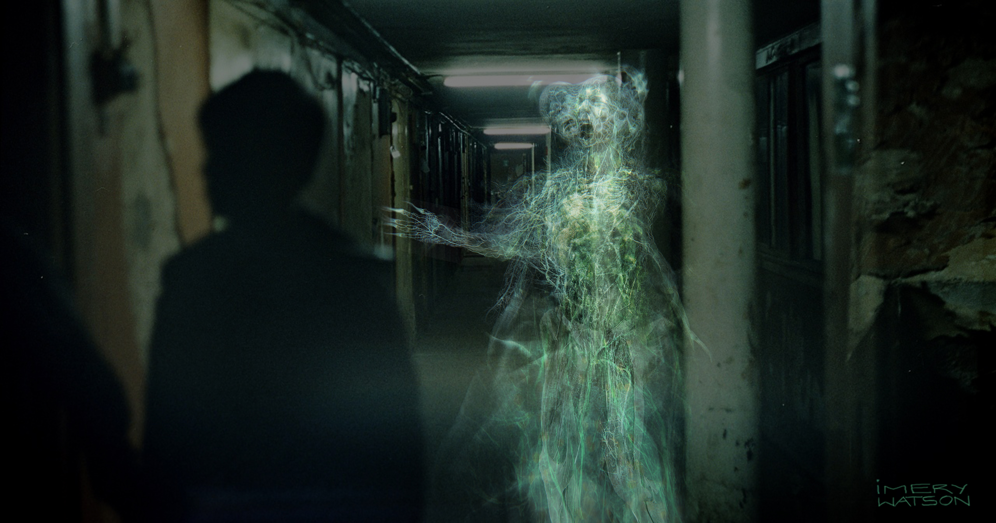
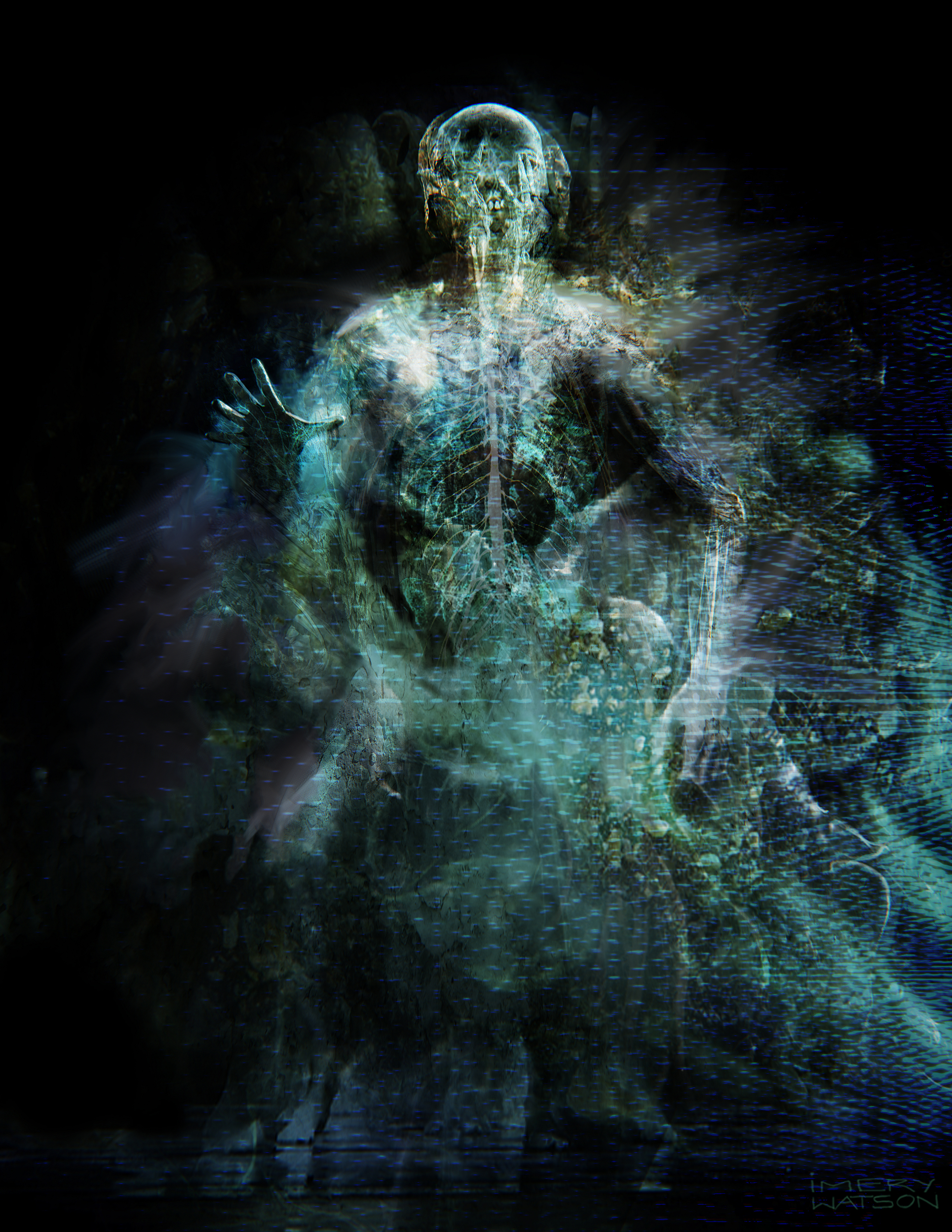
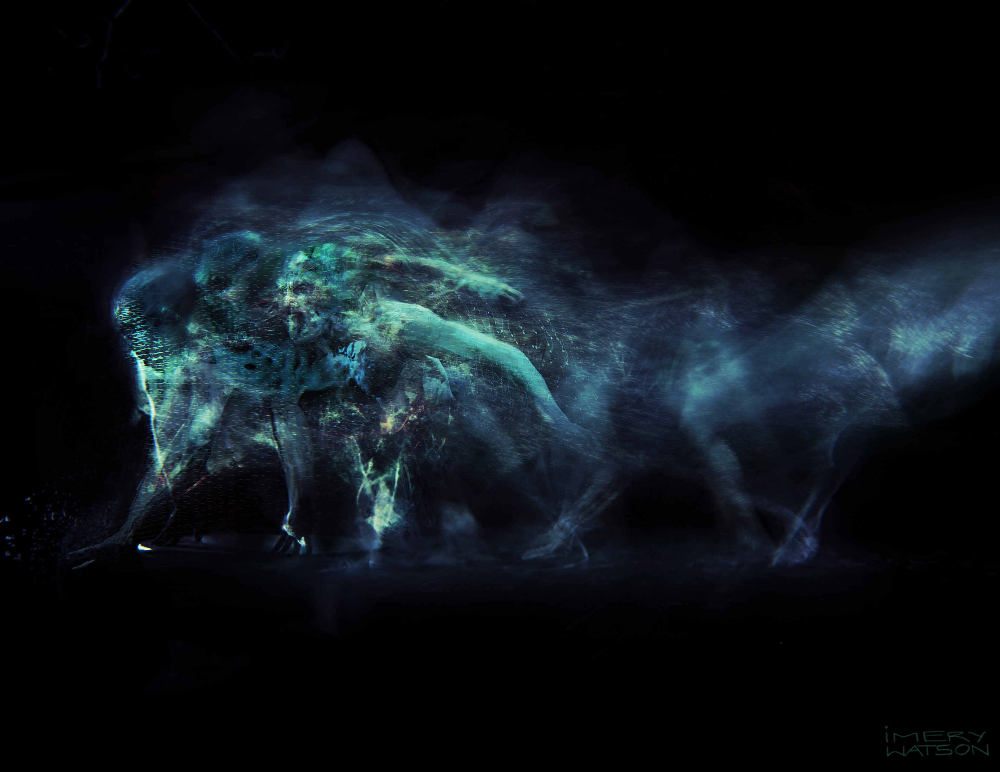
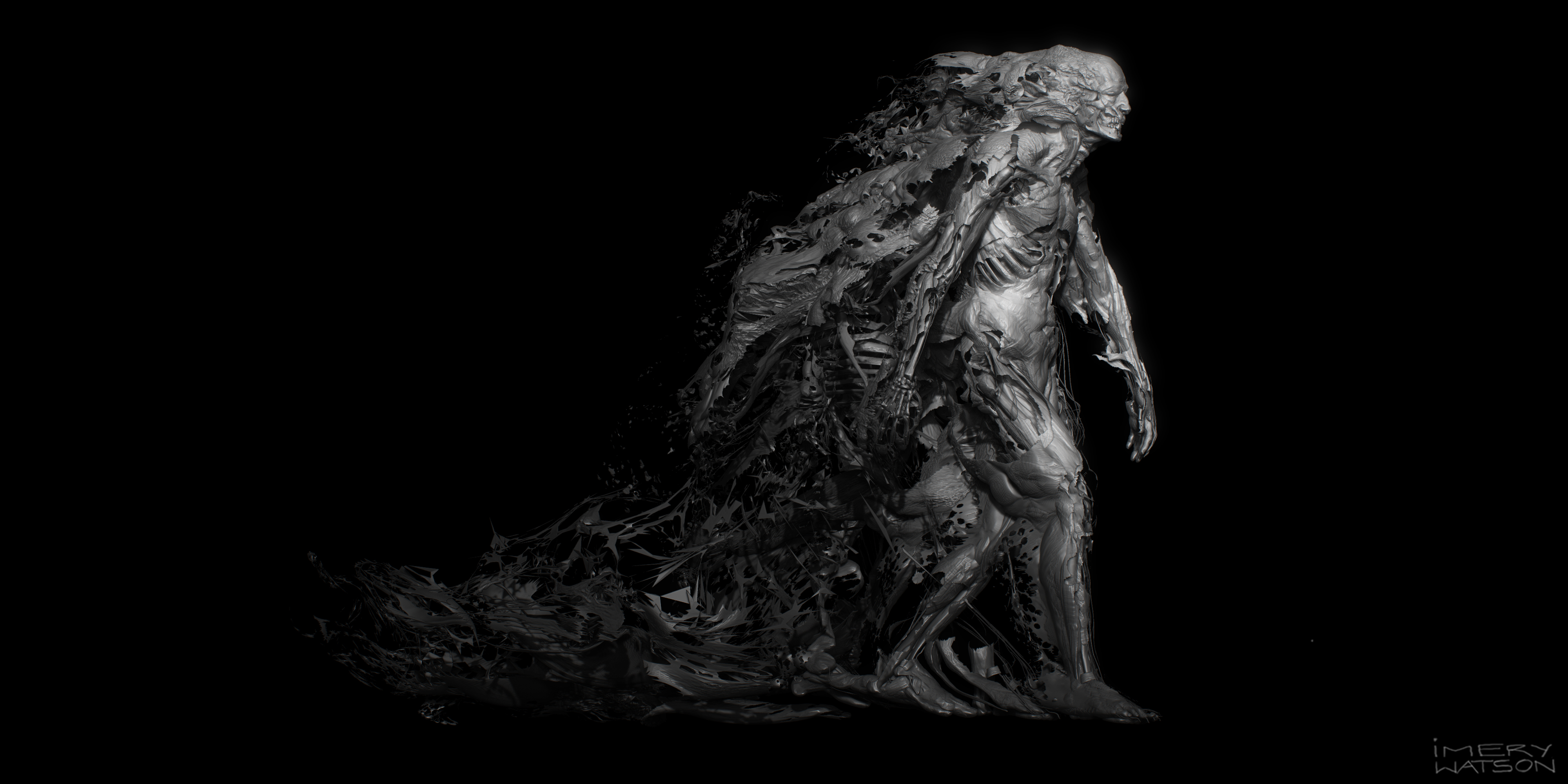
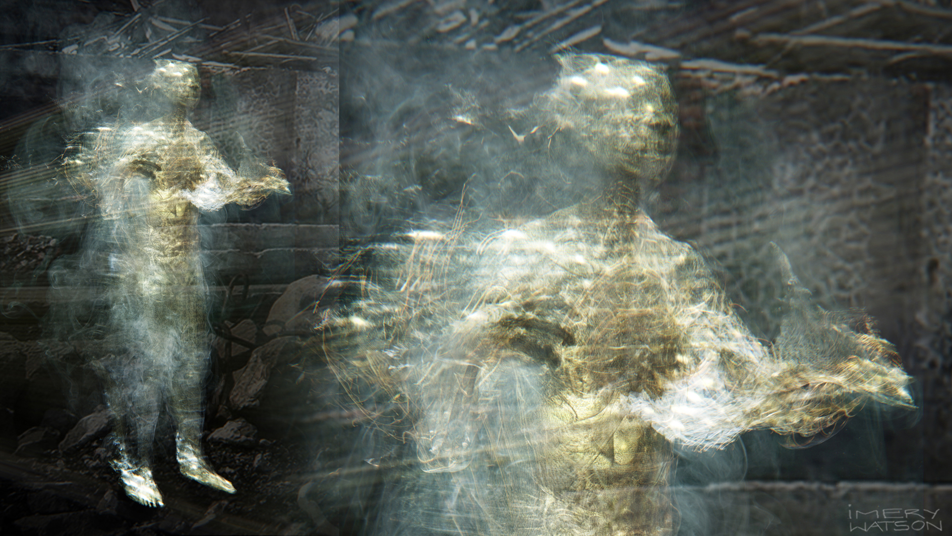
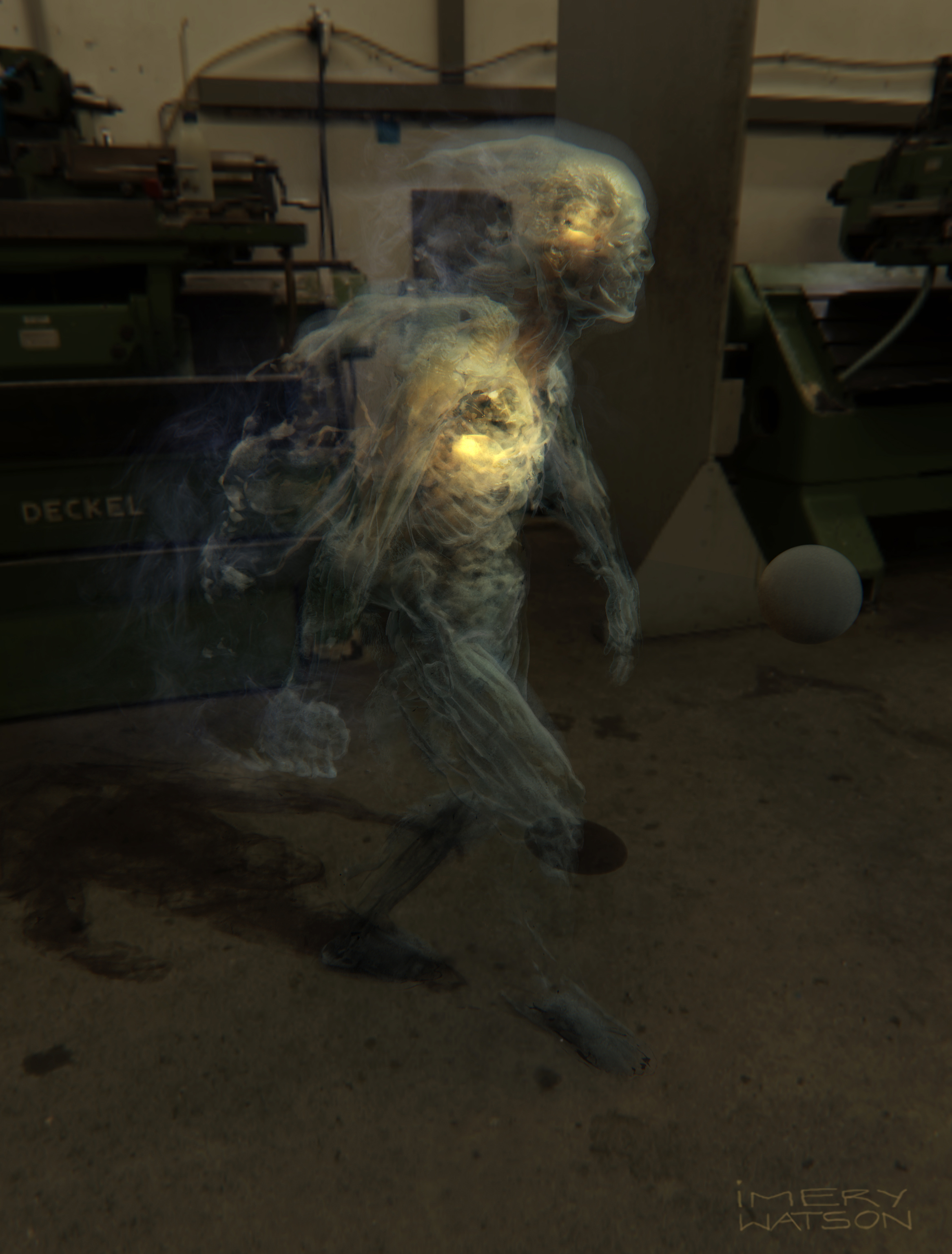
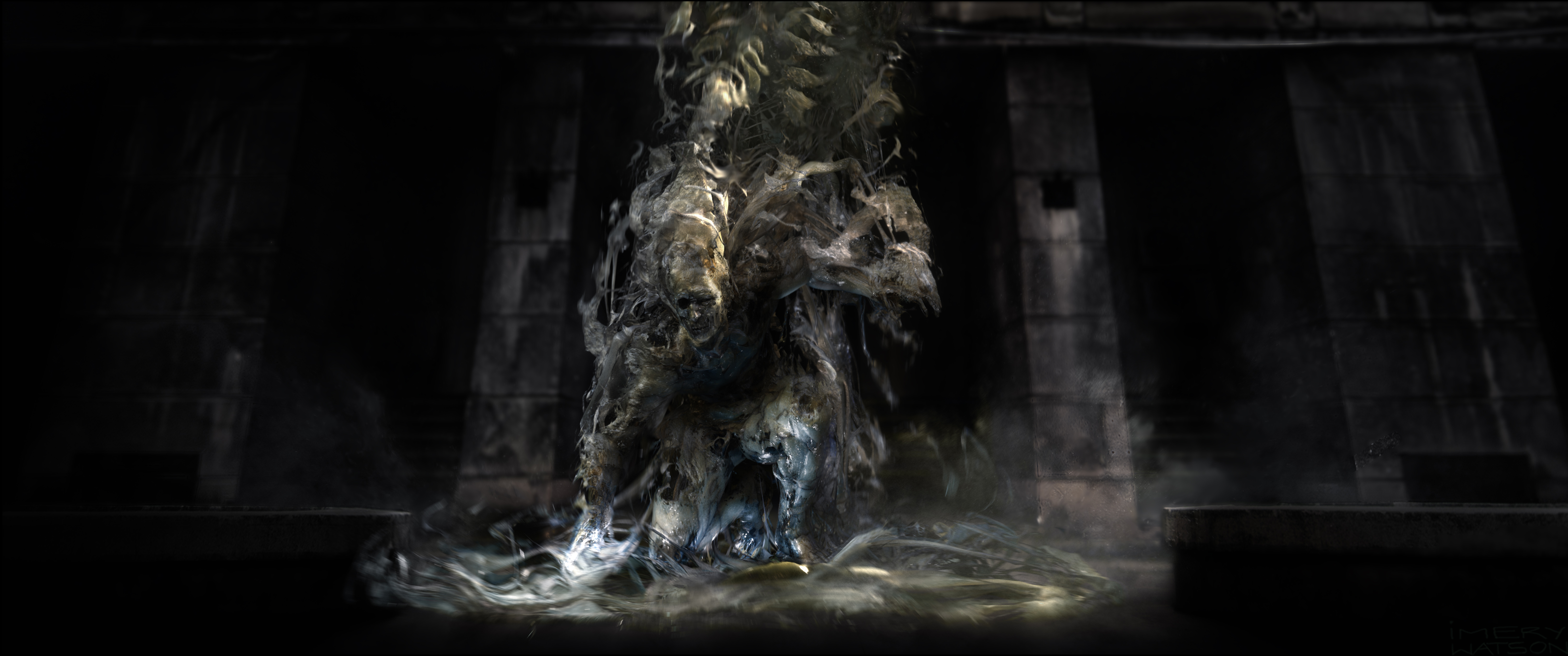
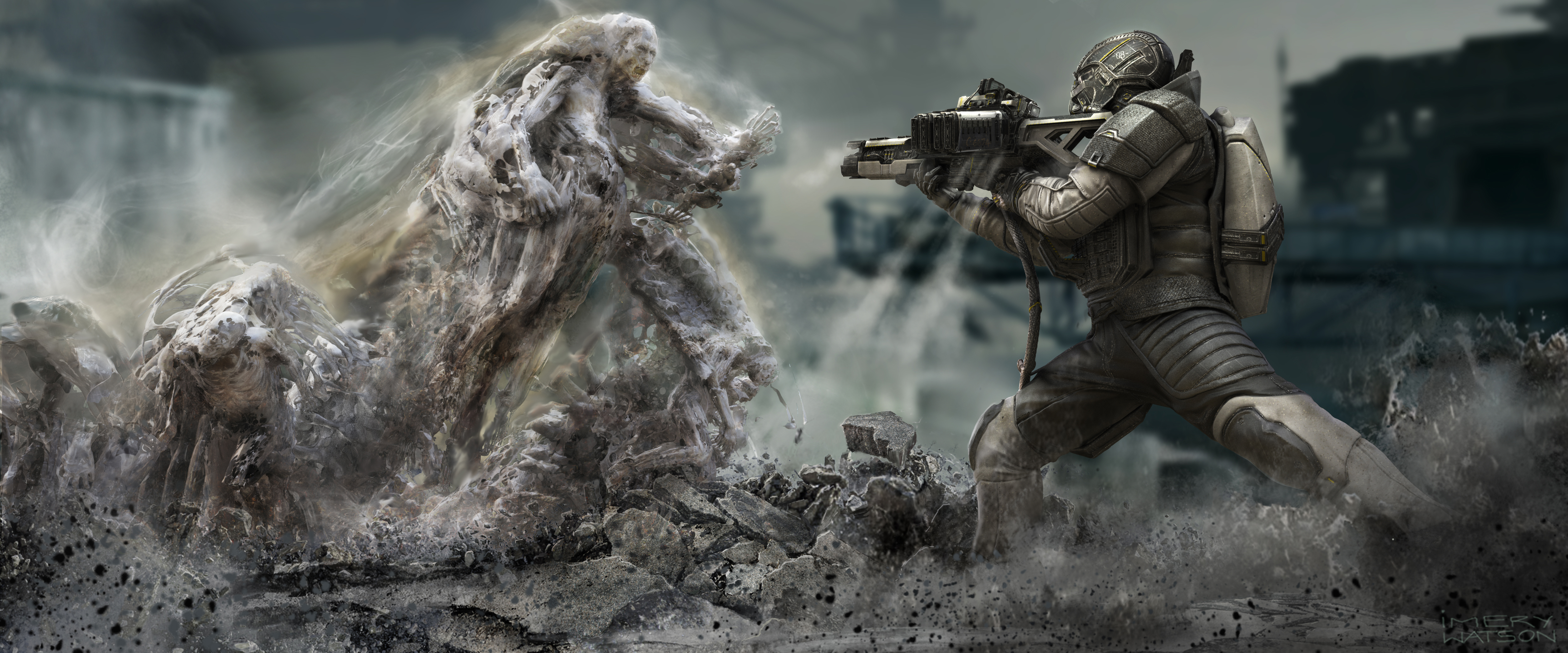
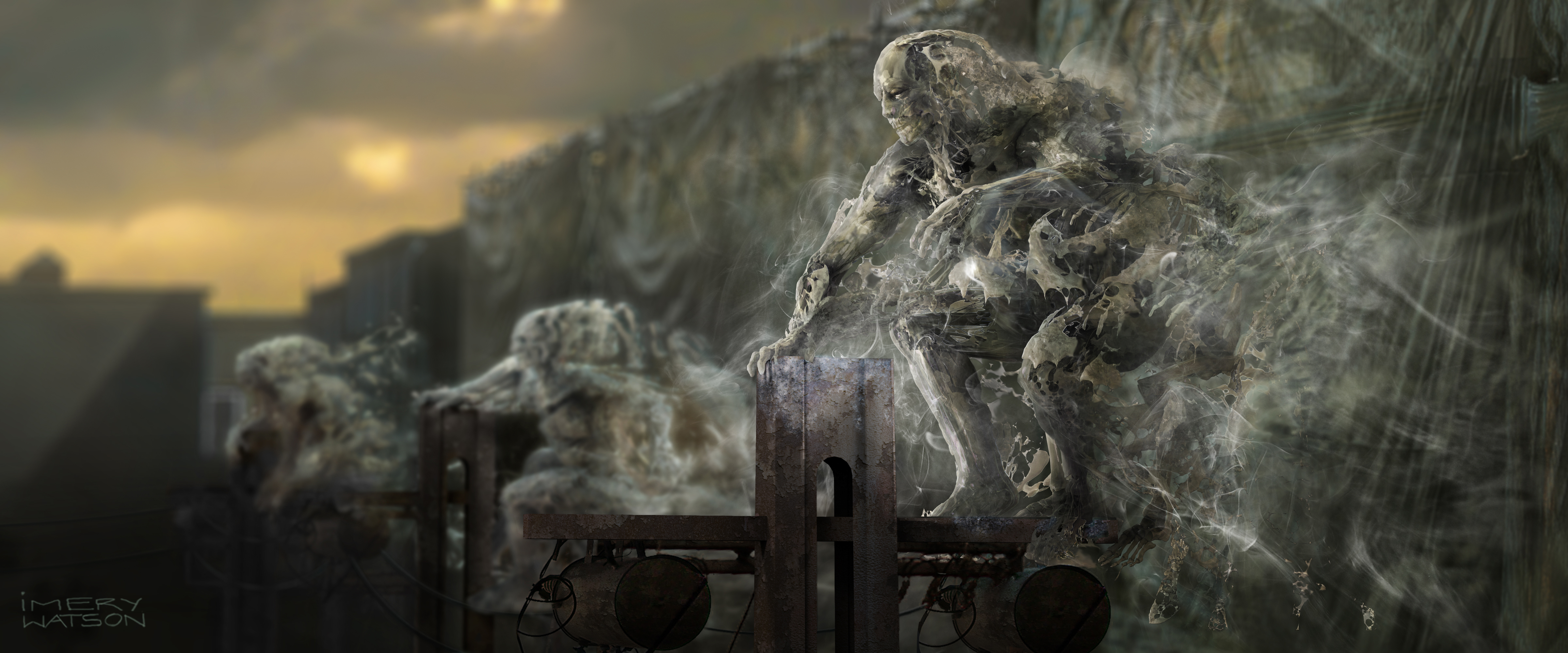
Netflix's Spectral presented a specific design problem: the antagonists are not monsters in the conventional sense. They are human beings in a different energy state — partially visible, leaving disintegrating trails, their appearance changing scene by scene while remaining recognisably the same system. The design had to encode its own narrative logic.
An additional constraint drove the visual language: the creatures are only visible through a device carried by the protagonists. The appearance had to simultaneously convey energy state and mediated perception — the fibrous, woven quality is not just aesthetic, it explains the mechanism by which they are seen. The design process moved from painted concepts establishing the effect language, through ZBrush sculpts that solved the form problem three-dimensionally, to scene-specific painted frames showing the system working across multiple contexts and creature types.
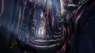
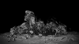
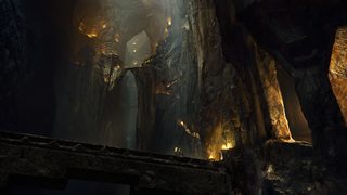
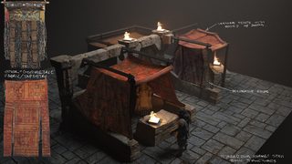
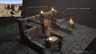
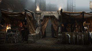
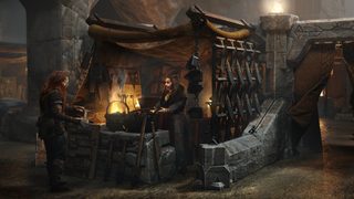
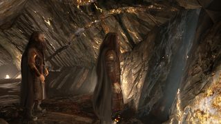
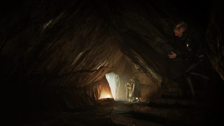
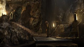
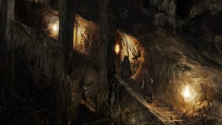
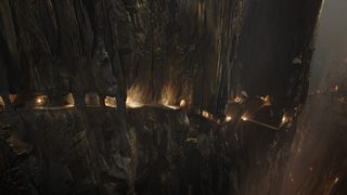
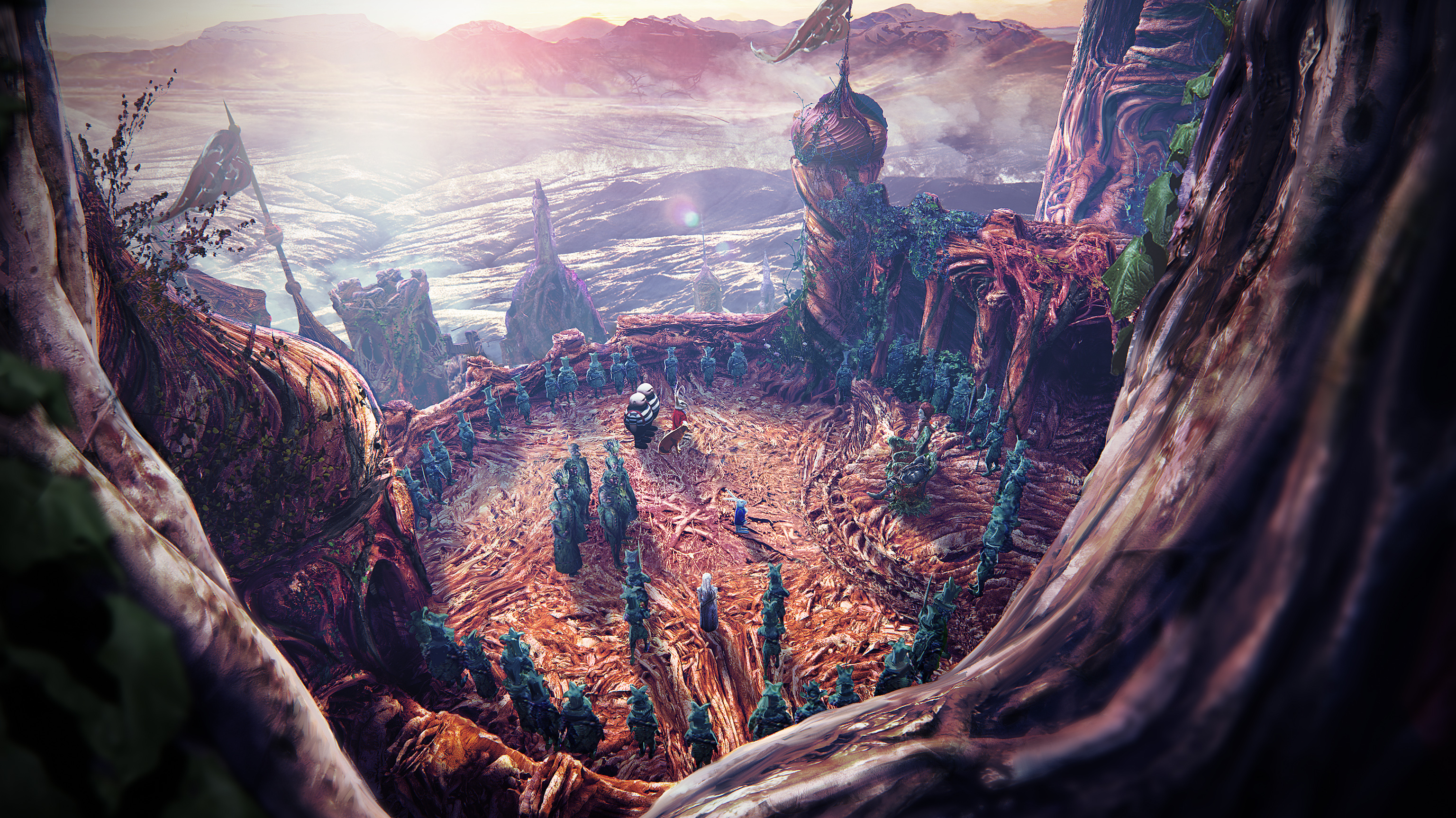
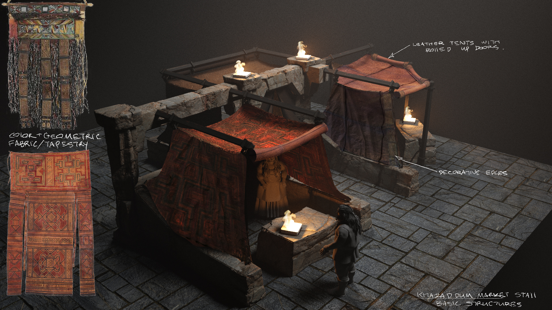
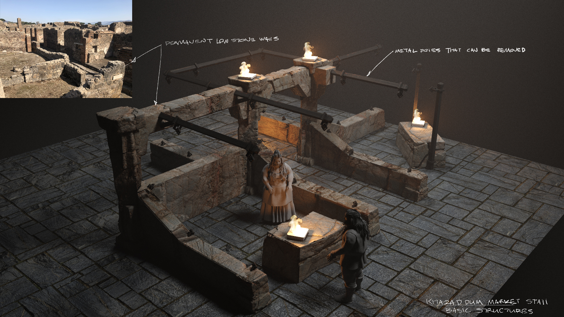
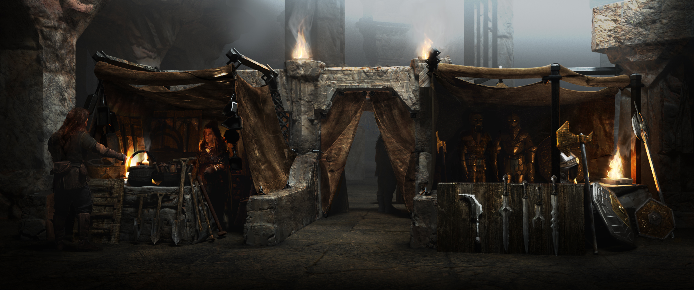
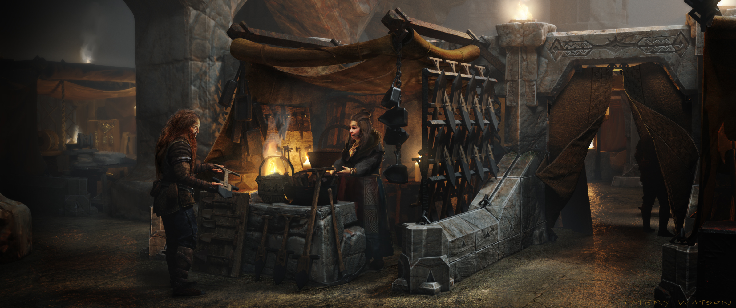
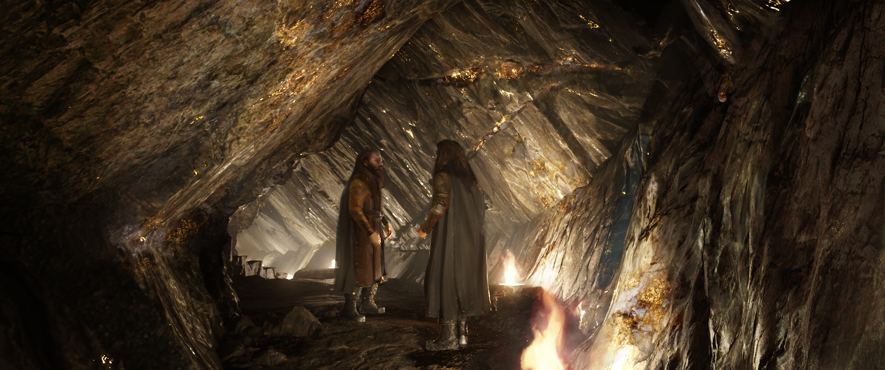
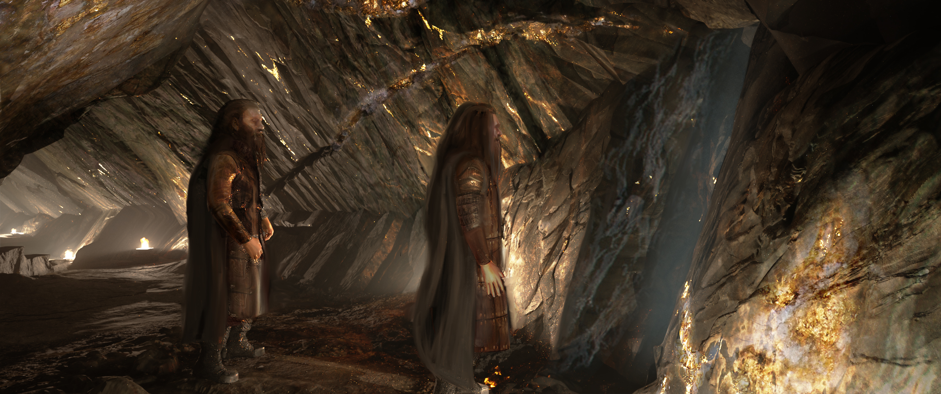
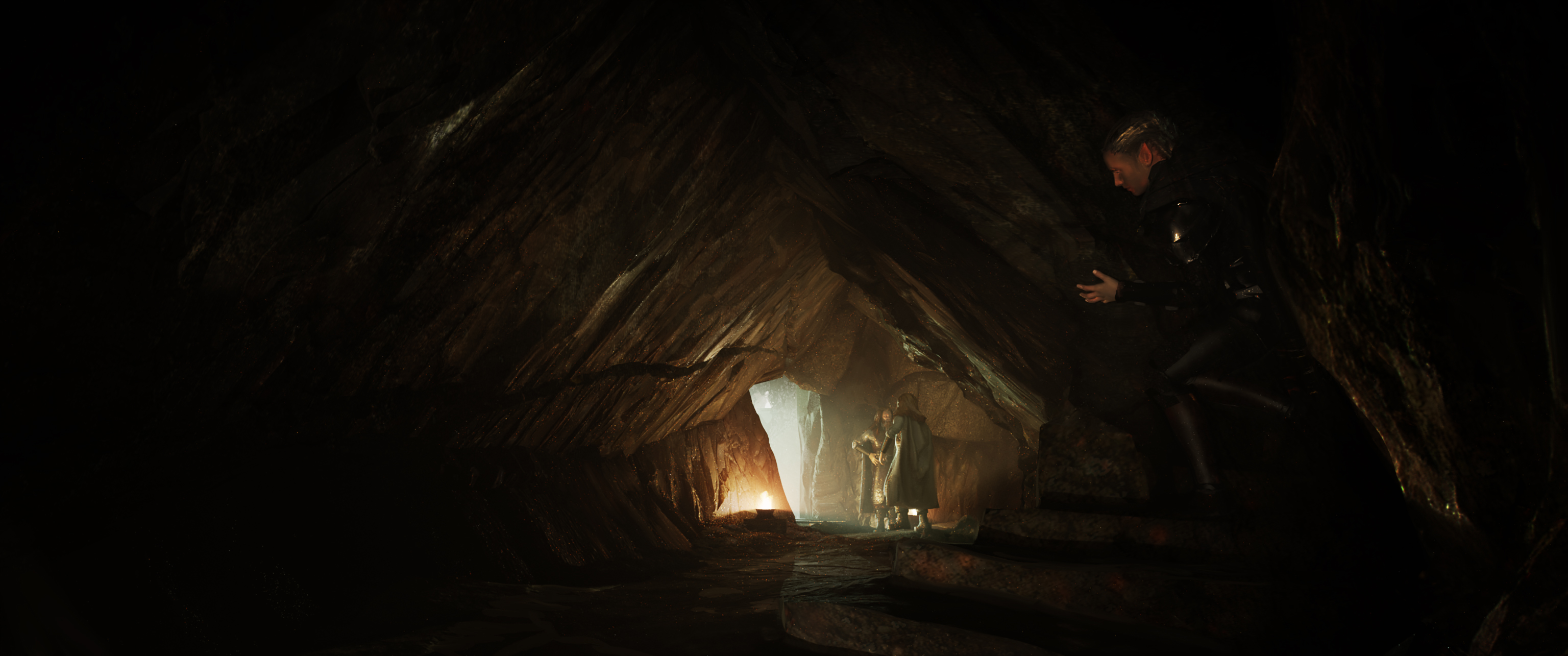
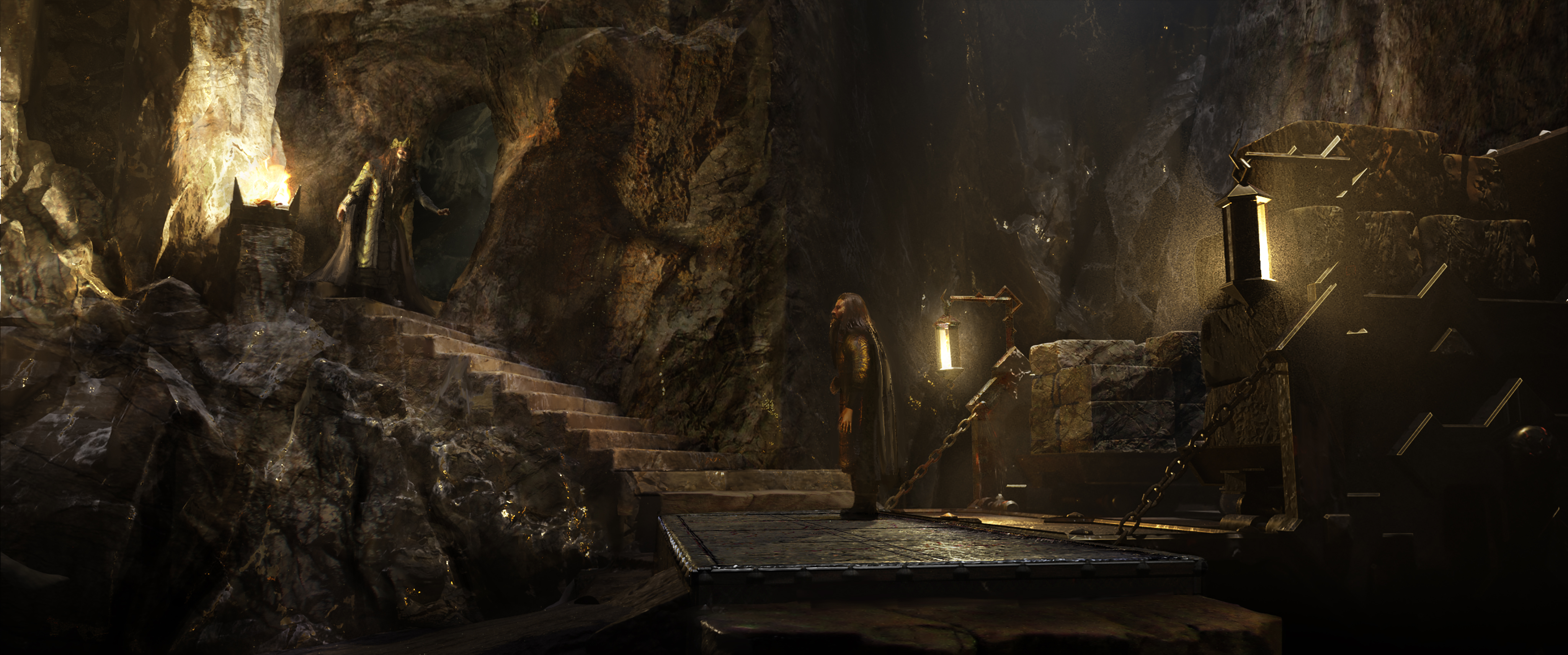
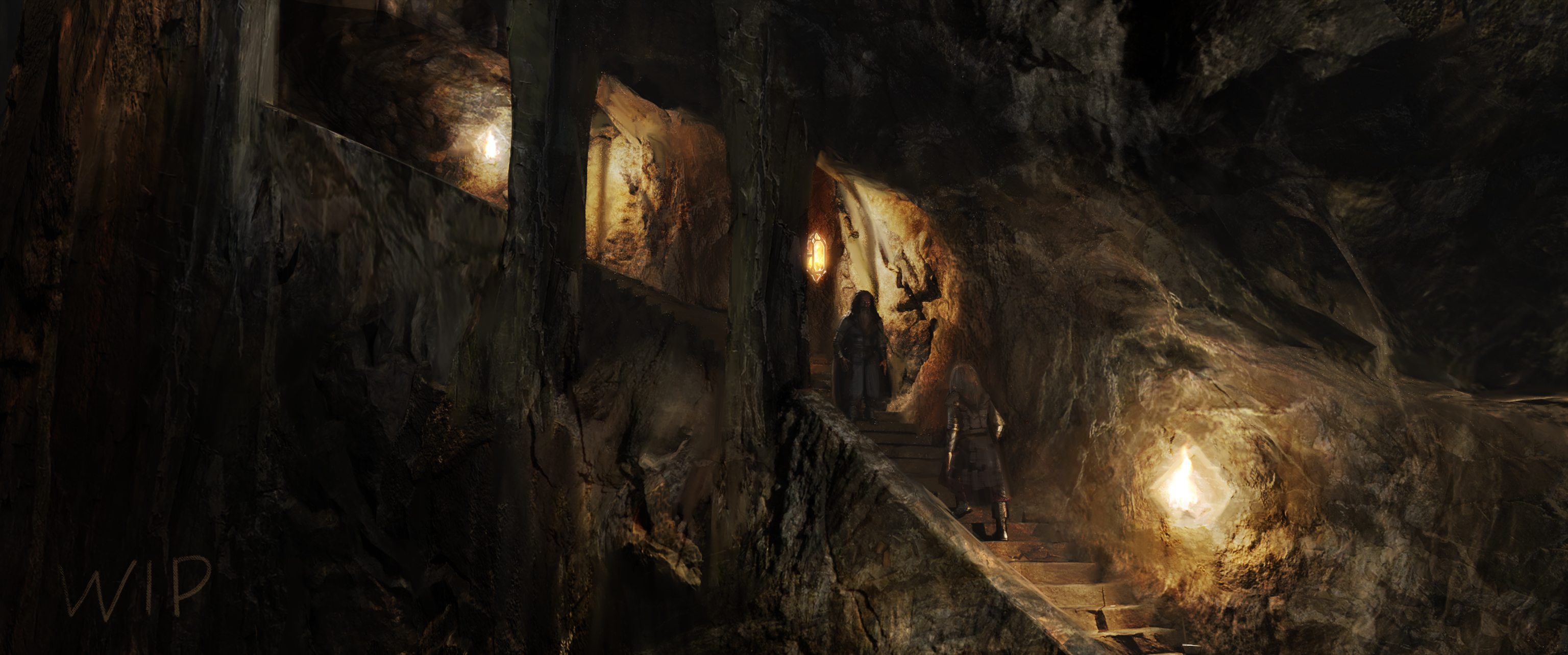
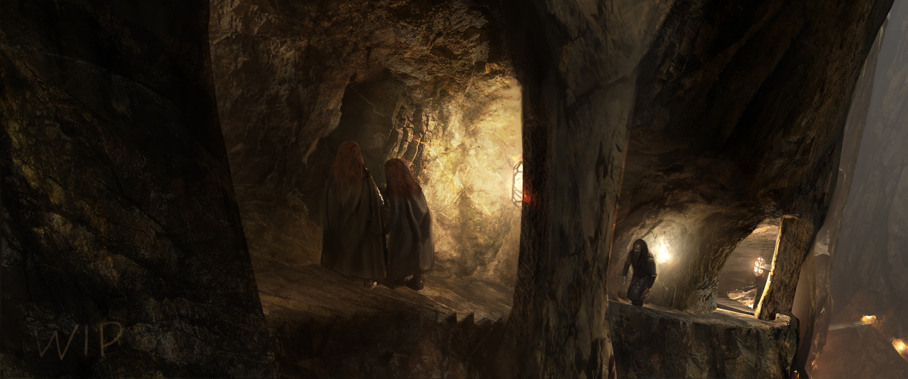
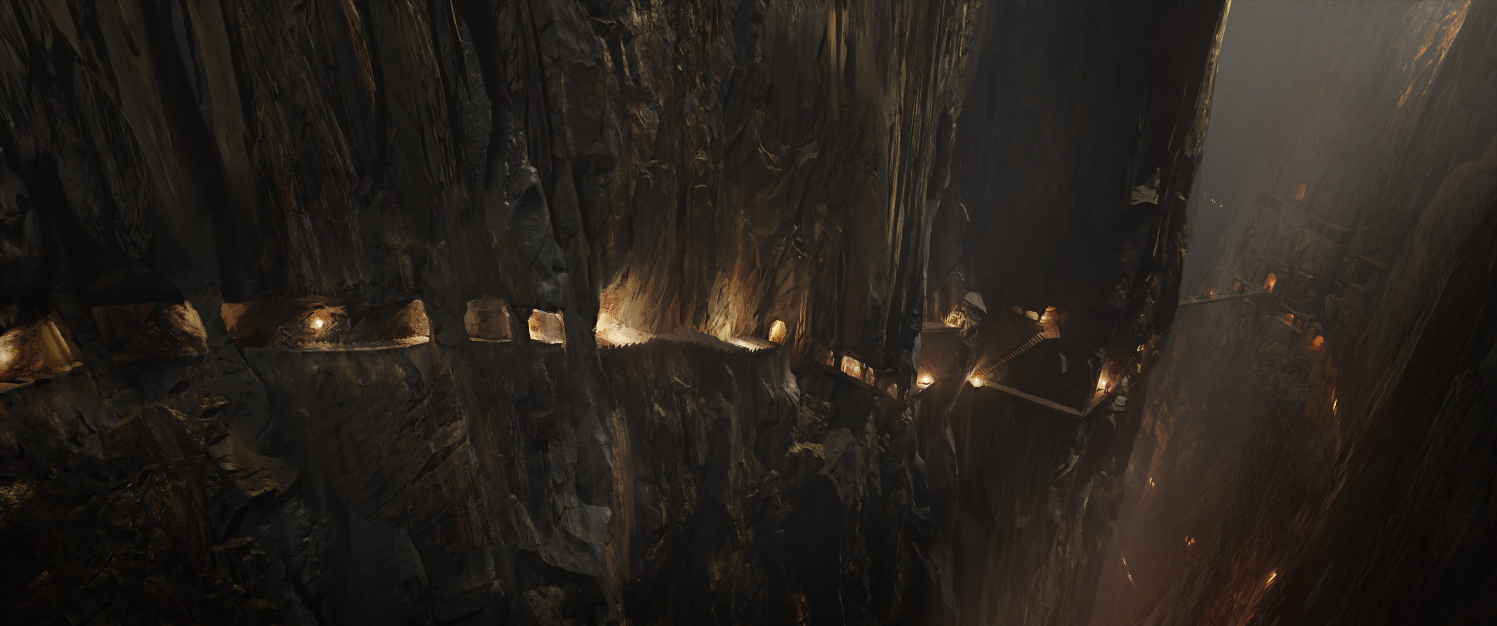
The Rings of Power required working within one of the most rigorously defined fantasy worlds in literature — Tolkien's Middle-earth — while producing something new enough to justify a billion-dollar production. The brief was specific: flesh out environments and scenes to reflect the narrative. Every image made in service of what needs to happen in that space.
The Khazad-dûm work spanned multiple location types — market stalls establishing the social and commercial life of the dwarven city, the mithril passages and hidden doors that carry the production's central narrative mystery, and the vast chasm spaces that communicate the scale and ambition of a civilisation at its peak. The annotated structural development work shows the production design thinking behind the final environments.