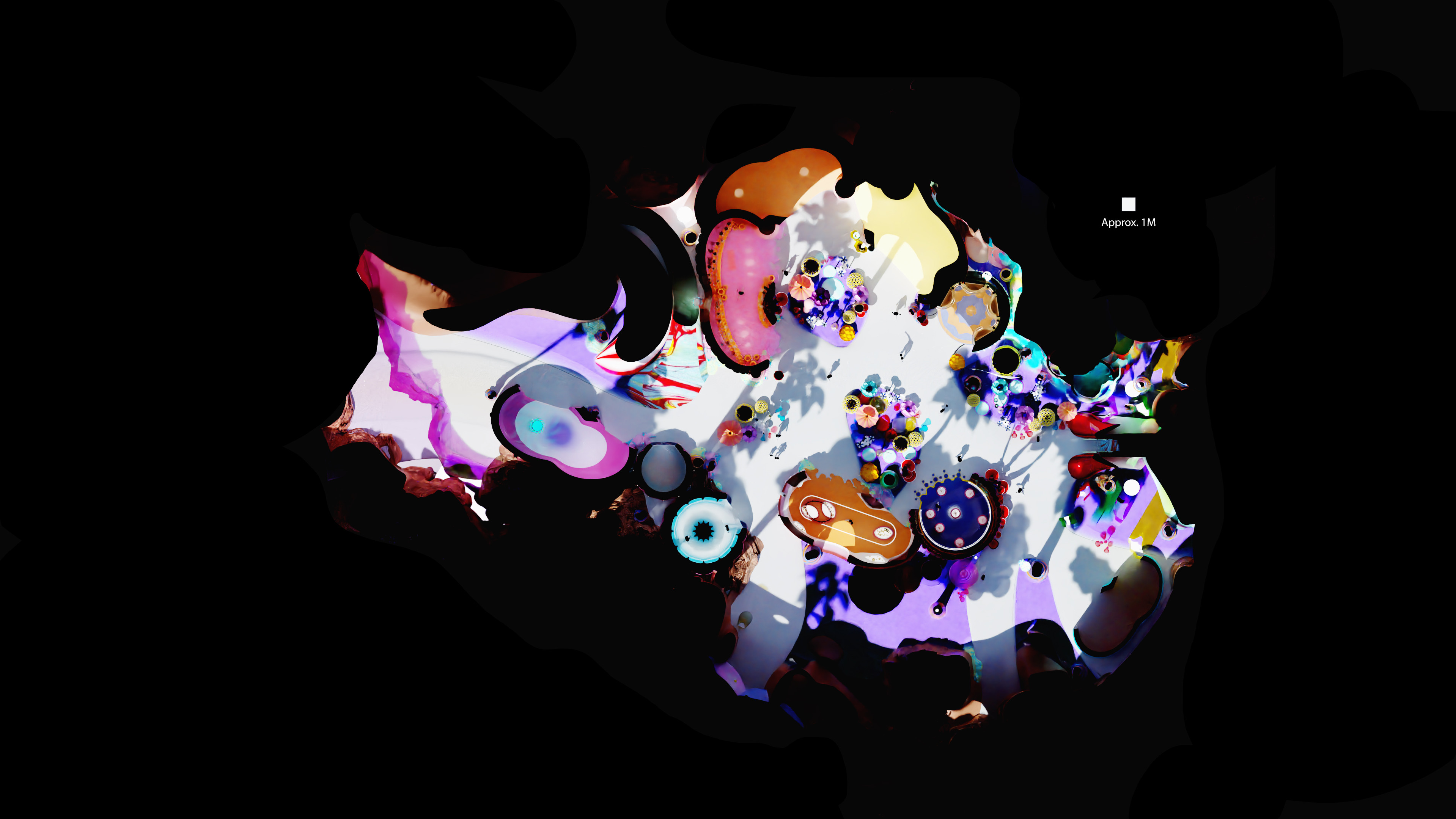
Overhead — the spatial geometry of the full environment, the scale marker at approximately 1 metre
A high-art experiential environment. Bright, surreal, and high saturation — a feast for the senses.
The brief demanded high art ambition in a commercial experiential format: a location-based environment where candy was both the theme and the material logic of the world. Every surface, structure, and spatial gesture had to read as something that had grown from sugar — not decorated with it.
The challenge was to hold two registers simultaneously: the surreal scale and saturation of a dream, and the operational reality of a space that had to move thousands of visitors a day. Legibility had to survive delirium.
A theme is decorative. A world has internal logic. The design question was never "does this look like candy?" — it was "what are the rules of a place where candy is the dominant material of the universe, and how do those rules produce architecture, landscape, and movement?"
At ground level the space operates through controlled disorientation — oversized forms that are immediately legible as candy but wrong in scale, creating a persistent sense of having shrunk into a world rather than entered a room. Pathways emerge from the geometry rather than being imposed on it.
Colour is load-bearing. The saturation palette establishes a chromatic logic: no surface is neutral, every material reads as a specific confection type, and the overall effect is of being inside something edible rather than something built. The space had to look like it had always existed.
Overhead — the spatial geometry of the full environment, the scale marker at approximately 1 metre